

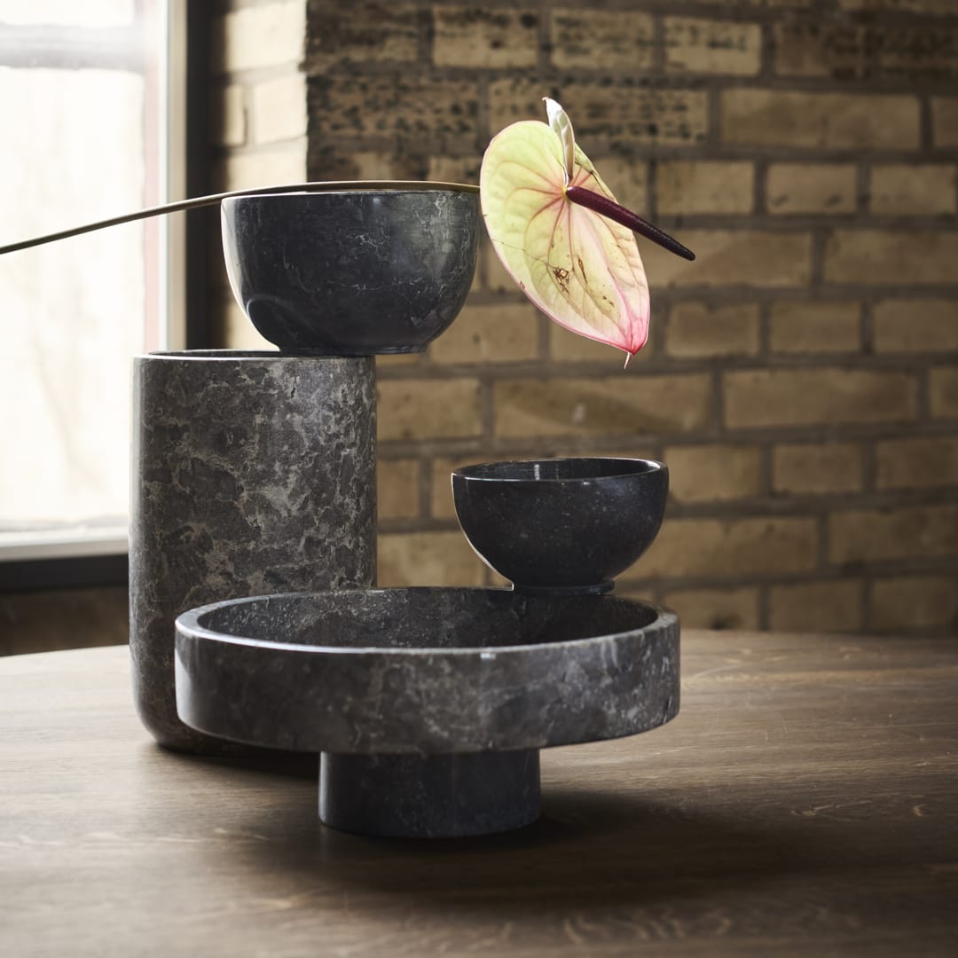
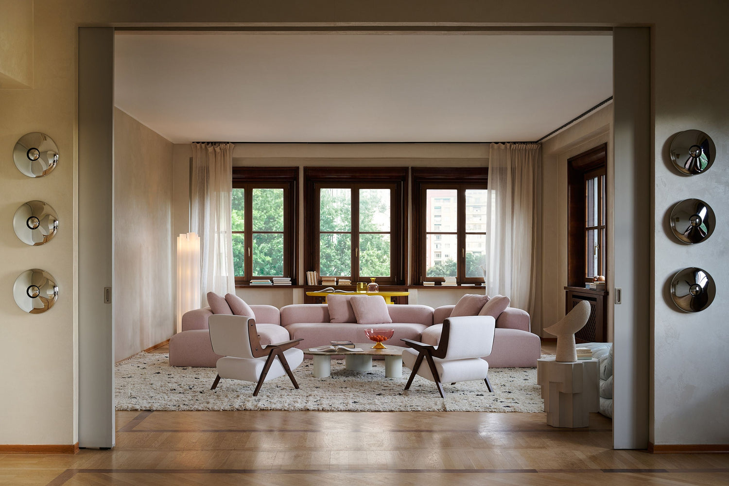
The future of interior design is no longer about what we see. It's about what we feel.
We continue the series, New Trends, in which we will discover together how the most interesting design trends for 2027 are born and evolve.
For many years, the world of decoration revolved around image perfection. Clean lines, strict minimalism, neutral palettes and spaces designed primarily to look beautiful to the eye and the lens.
But something seems to be changing.
In 2026, both at Milan Design Week as well as in 3 Days of Design of Copenhagen, design moved away from cold aesthetic perfection and towards something more human, more experiential and deeply emotional.
It is no coincidence that the theme of this year's 3 Days of Design was "Make This Moment Matter». A call to designers, brands and consumers to redefine what really has value. In an age of over-consumption, endless production and visual noise, the point is no longer to create more objects, but objects and spaces with substance, purpose and meaning.
This was exactly reflected in the most important presentations of the last exhibitions. The spaces that stood out weren't just based on impressive products or iconic furniture. They were spaces that created emotion. Places that affected our mood, and the way one experiences the environment around them.
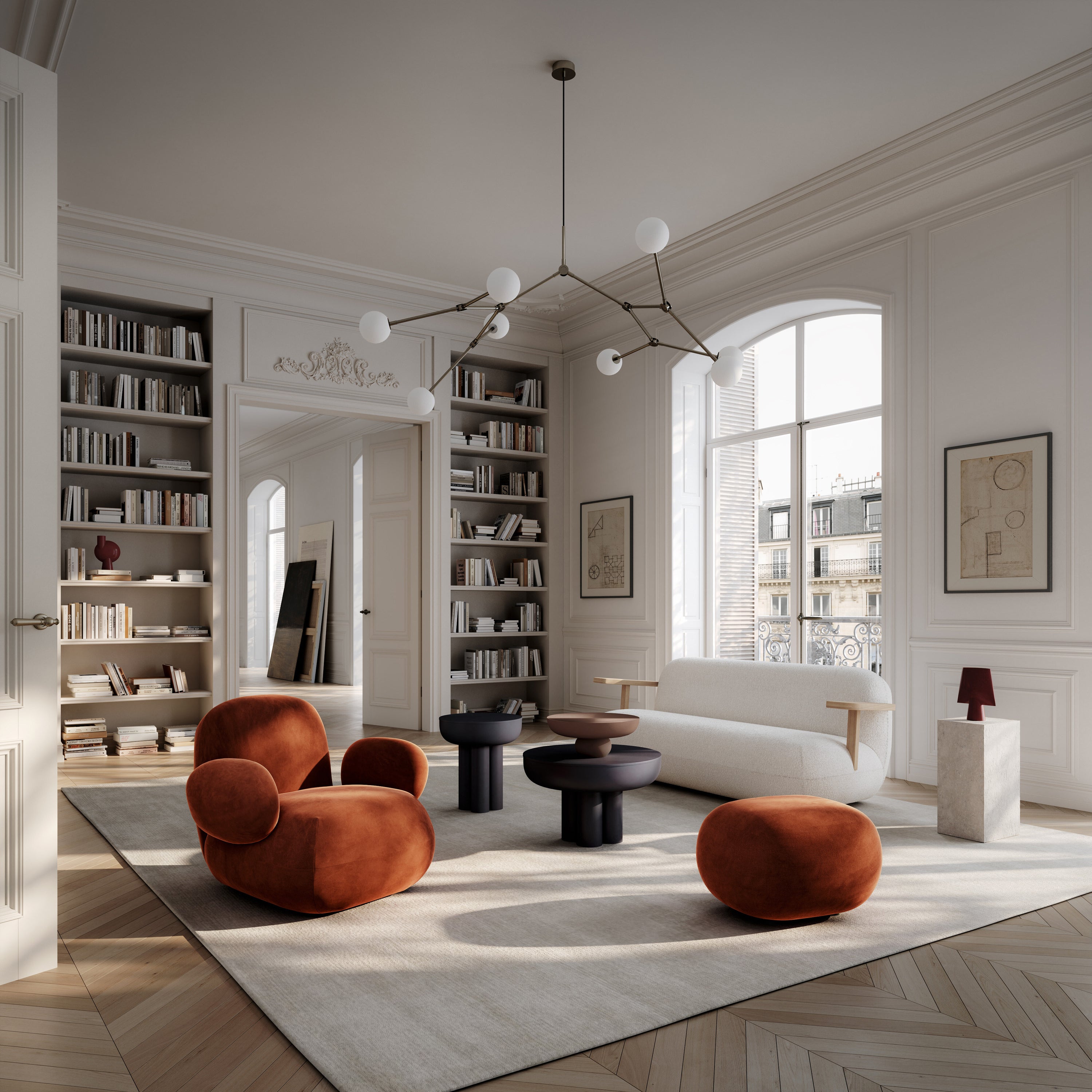
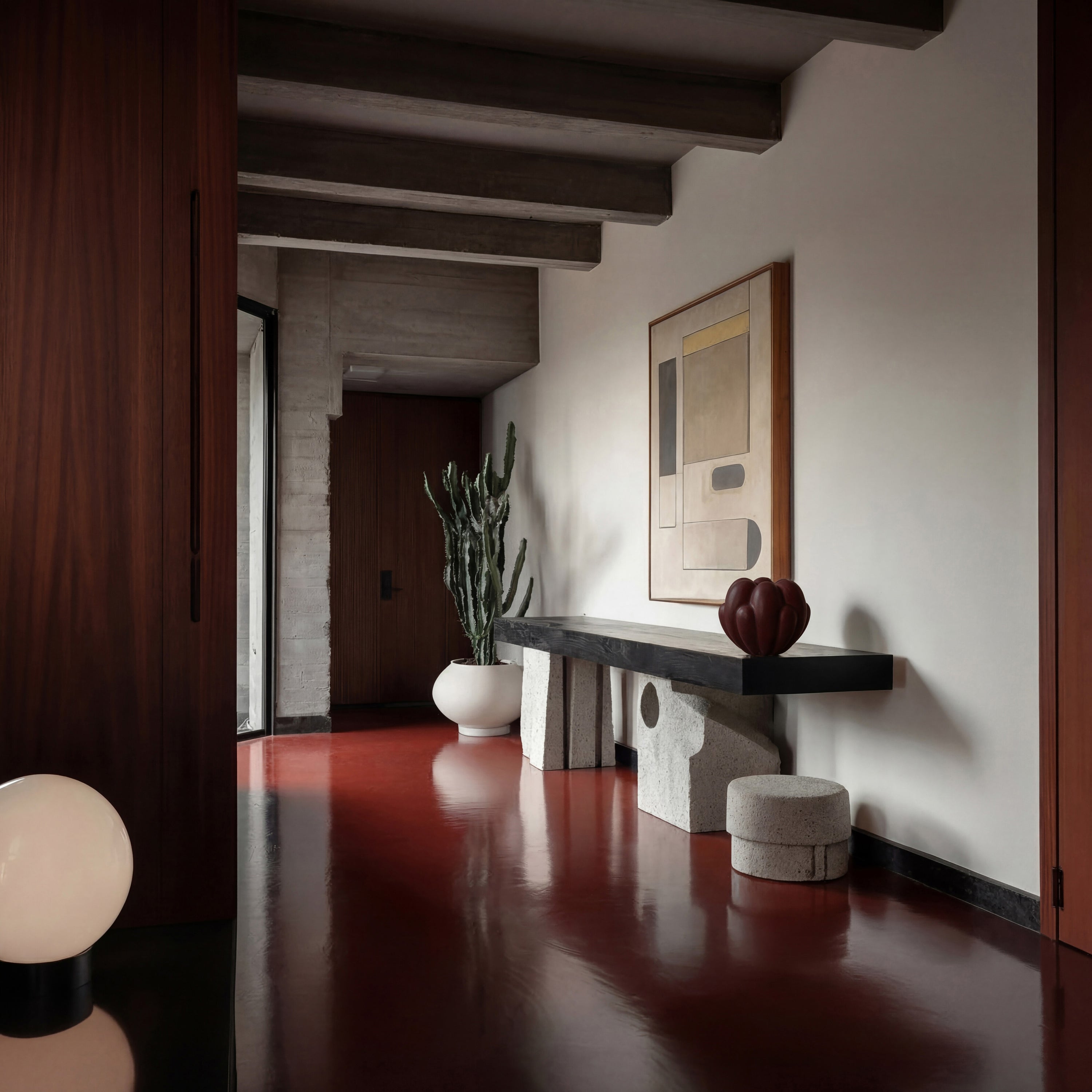

From explosive color installations to almost therapeutic pastel interiors and austere dark architectural spaces, Milan Design Week 2026 and 3 Days of Design revealed a new direction in the world of interior design. The home, the hotel, the office and in general the living spaces cease to function as simple scenes of everyday life and turn into experiences.
Perhaps the biggest trend of 2026 is not some new material, some color or a certain decorating style. Maybe it is the search for meaning. The need to design spaces that don't just impress, but they make a person feel something.
And this is perhaps the most significant change we see today in the world of design.
This new narrative was not just words. It was captured with impressive consistency in the most important presentations of this year's 3 Days of Design. Observing the exhibitions of the biggest brands, it quickly became clear that the focus was not on new products, new colors or new collections. Instead, the words that kept coming up were atmosphere, materiality, connection, well-being, sense of belonging and sensory experience.
Karimoku Case, through the exhibition "A Moving Presence", created a dialogue between wood, light and sound, transforming the space into a complete multi-sensory experience. The presence of a traditional Japanese tea ceremony further emphasized the importance of slowing down and being mindfully present. In the report "Composed Matter”, Norm Architects used light, shadow and textures as the protagonists of the composition. Visitors were invited not just to look at objects but to observe how small changes in lighting and materials can completely change the perception of a space.


We encountered a similar approach at Audo Copenhagen, where the exhibition "Quiet Grandeur» suggested a more peaceful and timeless version of modern living. Here design was not presented as an object to be consumed but as a means of creating atmosphere, hospitality and human connection.
The same need for more meaningful experiences appeared in Galleri Sonja's exhibitions BRANDT Copenhagen and Wendelbo. Sometimes through the relationship of nature and craftsmanship, sometimes through touch and materiality, and sometimes through the exploration of the new balance between work and personal life, the aim remained common: the creation of spaces that activate the senses and strengthen the emotional connection of man with his environment.
So perhaps the most important conclusion of 3 Days of Design 2026 is that design is entering a new era. An era where the value of a space is not measured solely by its aesthetic perfection but by how it makes people feel when they are inside it.
And if Milan Design Week showed us that spaces turn into experiences, 3 Days of Design came to explain why this happens: why today we are looking for more meaning, more connection and more moments that really deserve to be remembered.





The new generation of colors
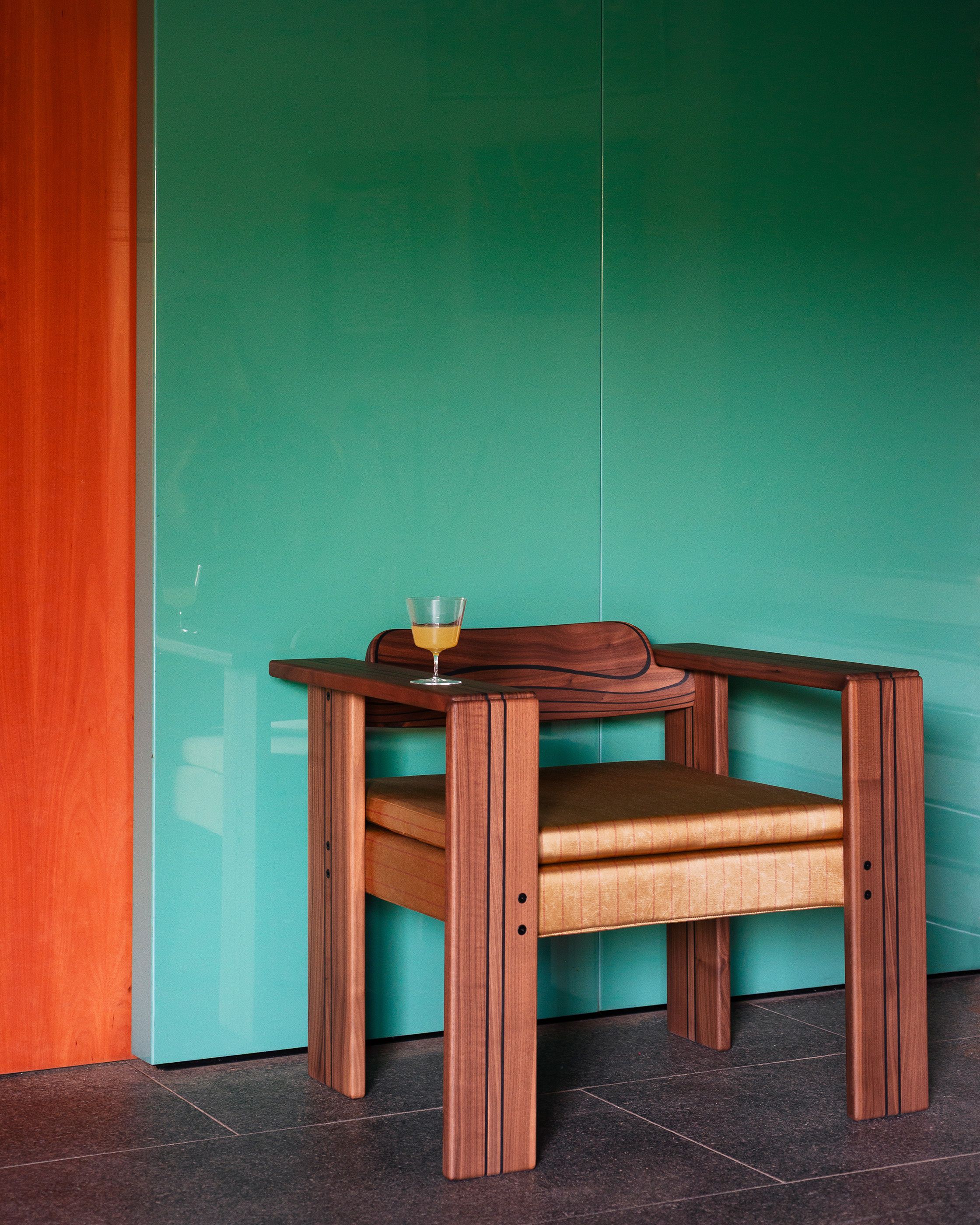
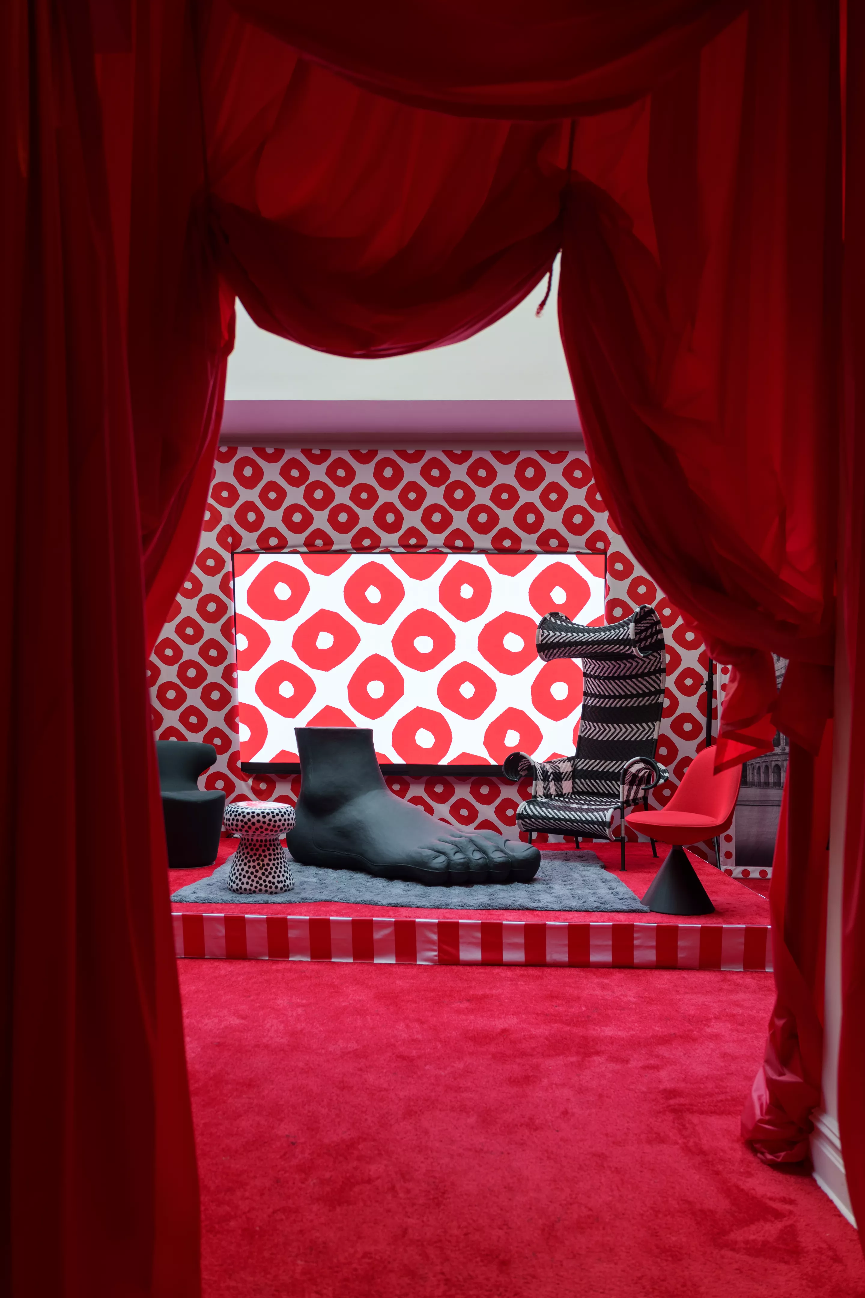
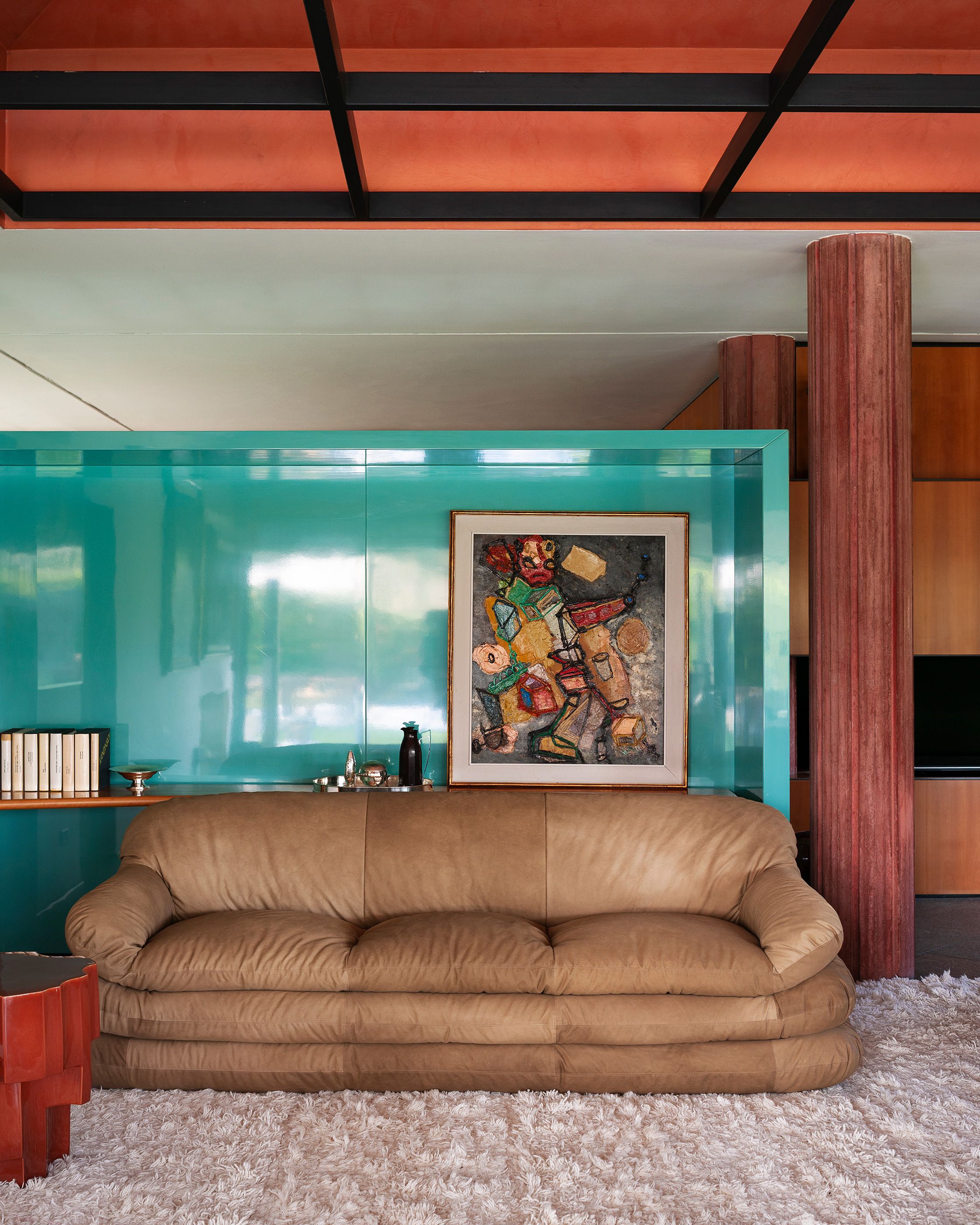
One of the most obvious elements of this year's event was the dynamic return of color. But not in the way we used to know it. Color was not just used decoratively.
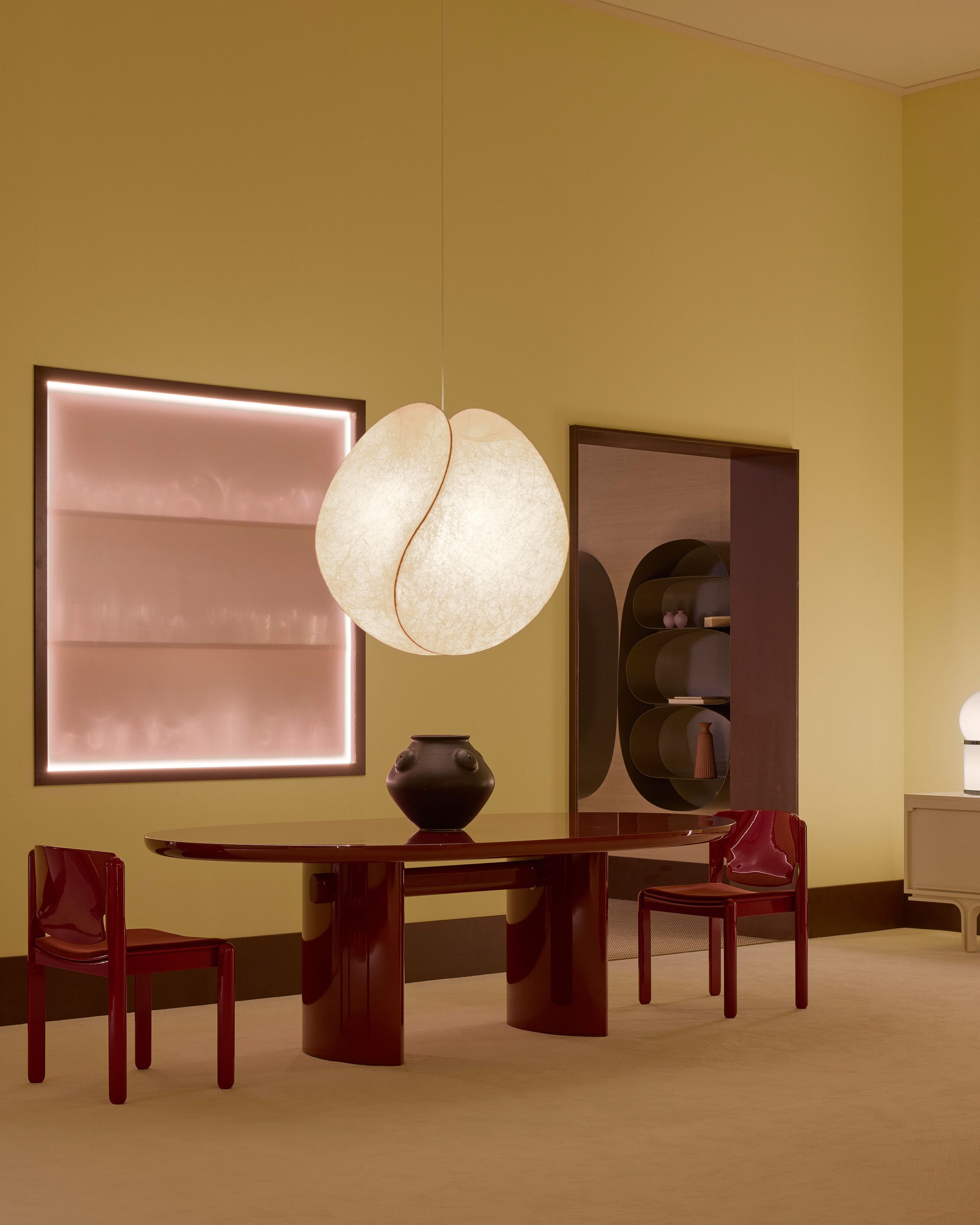
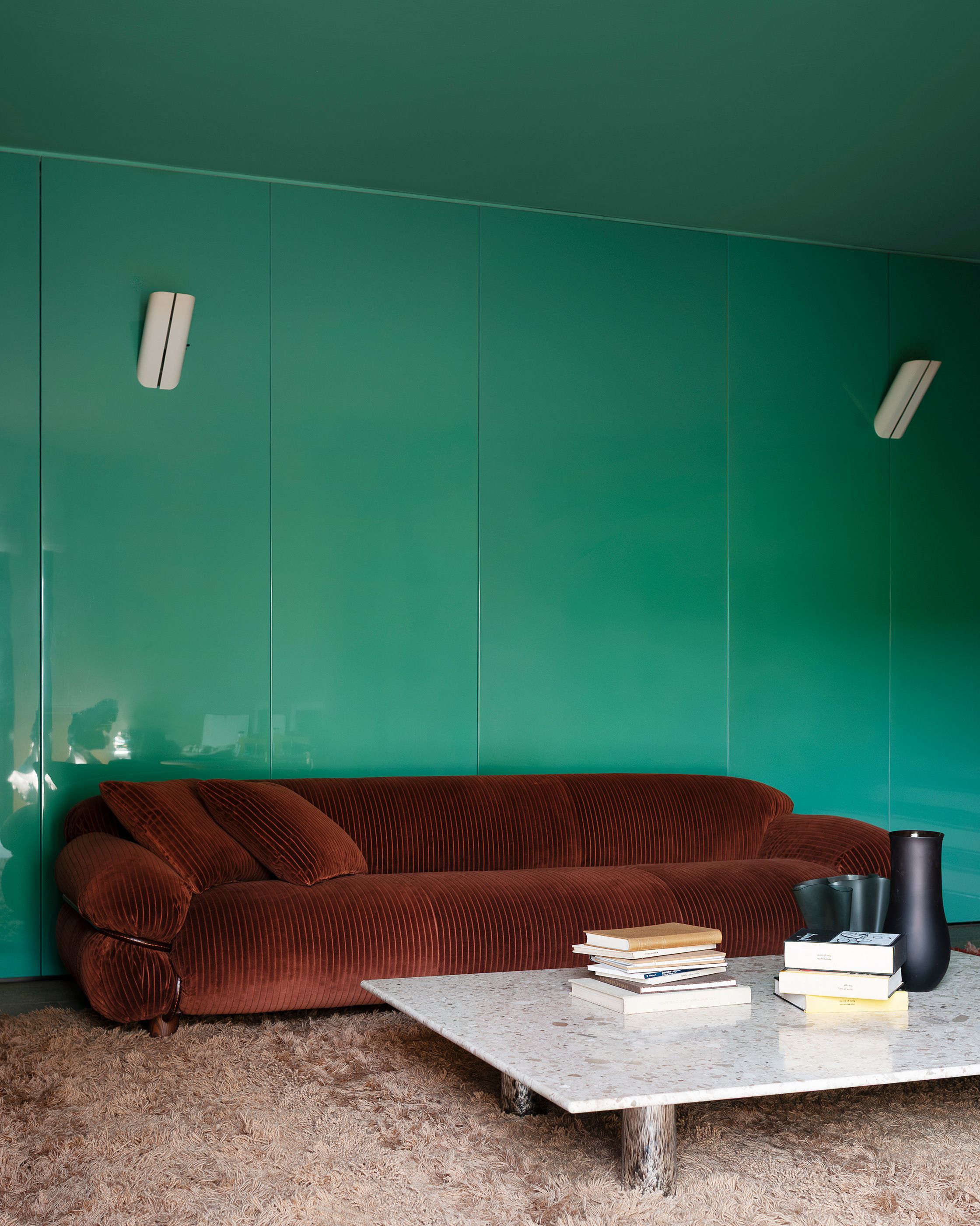
It was used to create tension, energy and a strong identity within the space. Deep cobalt blue, bright signal yellow and intense shades of it red and his orange appeared in installations, furniture, exhibition stands and hospitality concepts, creating spaces with almost cinematic tension. This aesthetic seemed in many places influenced by the digital world and the images that are now created through AI and social media. The colors had an oversaturated intensity, almost as if they came off a screen.
After years of "safe" neutral interiors, it seems the need for more personality and emotional arousal returns in full swing.



The rise of dark and monolithic interiors
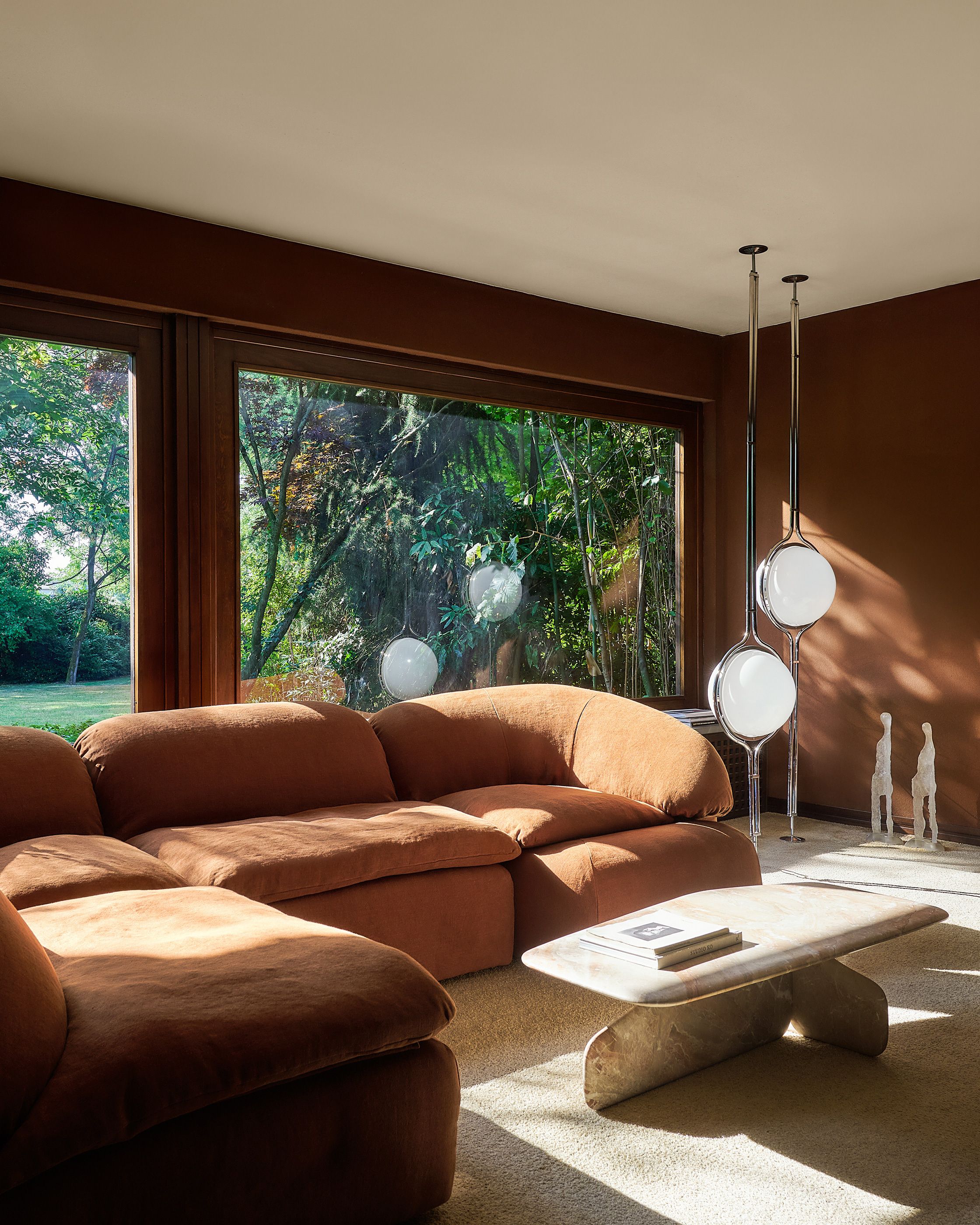
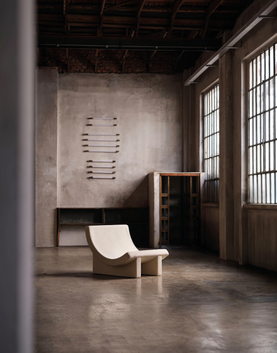
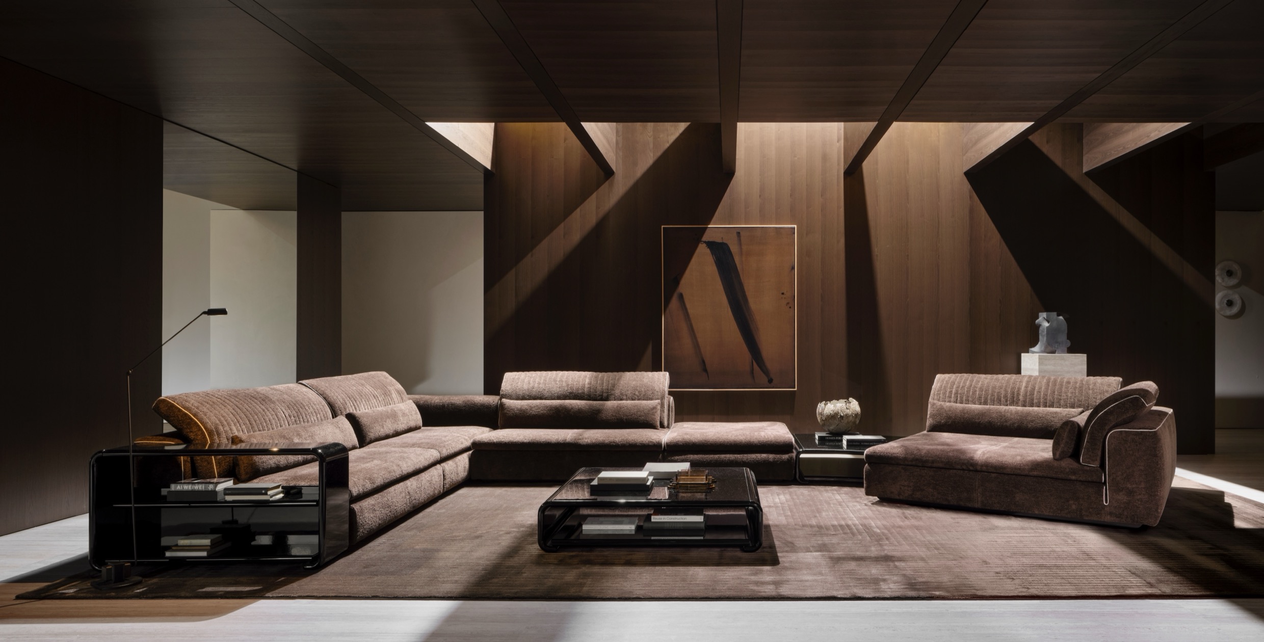
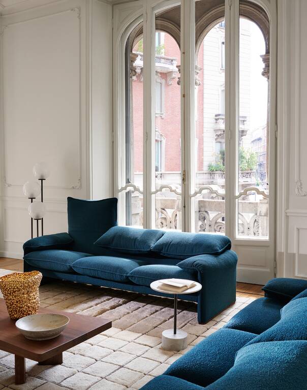
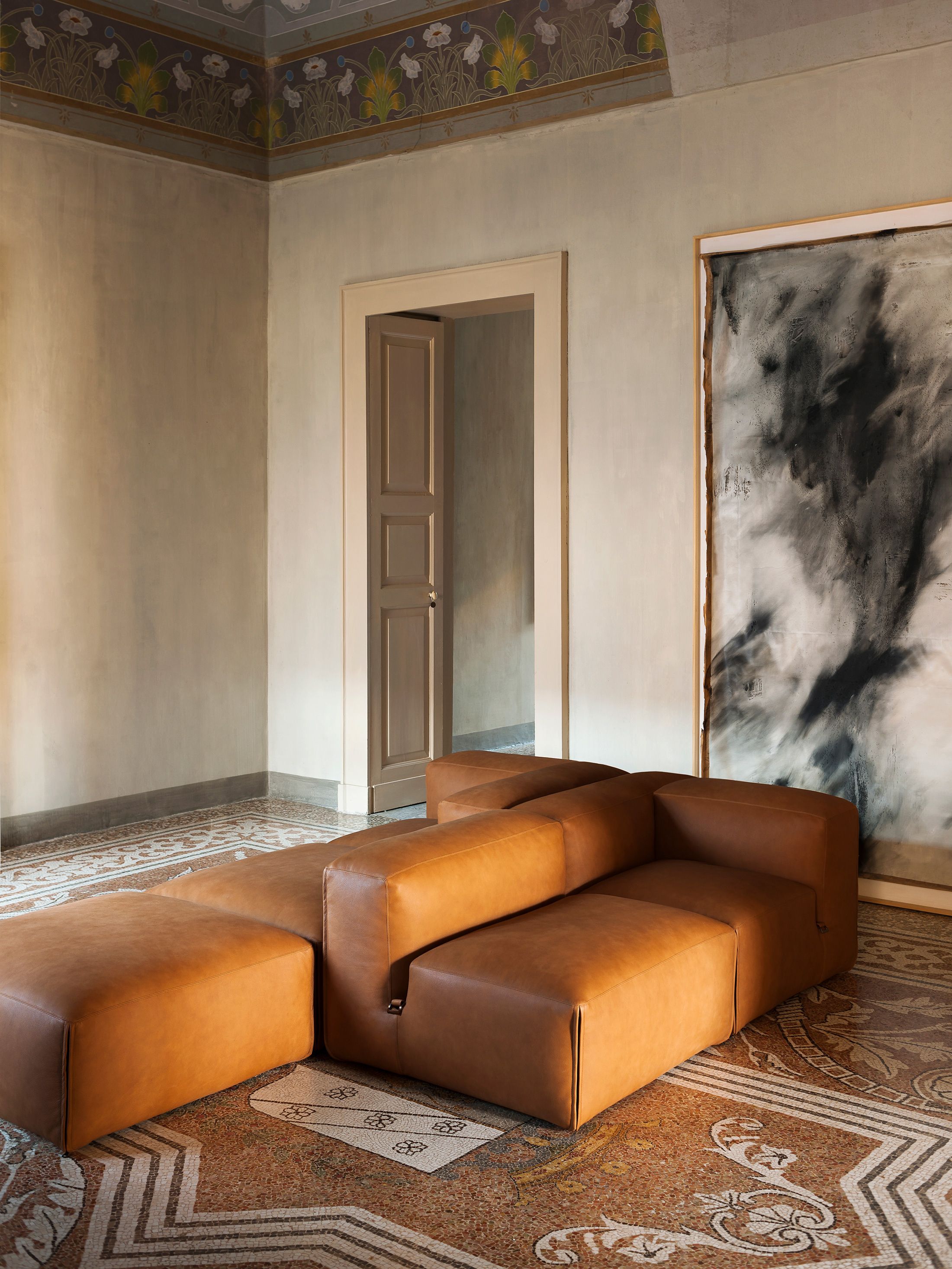
In contrast to the strong color expression, a second strong trend appeared in Milan: the deeply architectural, dark and almost monochromatic spaces. Shades like graphite, smoked grey, deep black and oxidized metal they created more austere, quieter and particularly sophisticated atmospheres.
These spaces were not based on excess but on a sense of control, balance and calm. The interesting thing is that, although they were dark, they did not give the feeling of coldness. On the contrary, they were creating an almost protective atmosphere. Light was used very selectively, textures took on a leading role, and materials —smoked wood, brushed metals, smoked glass and stone finishes— gave depth instead of decorative chatter.
It is an aesthetic that seems to express the need for “visual decongestion” in a world of information overload and constant stimulation.



Soft luxury and interiors that work therapeutically
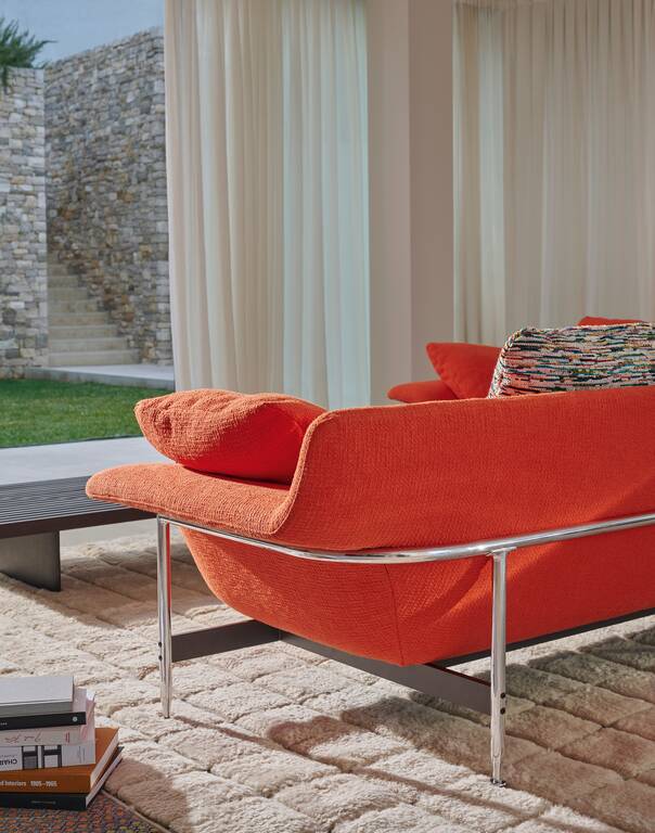
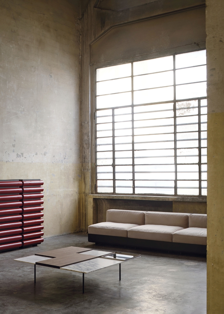
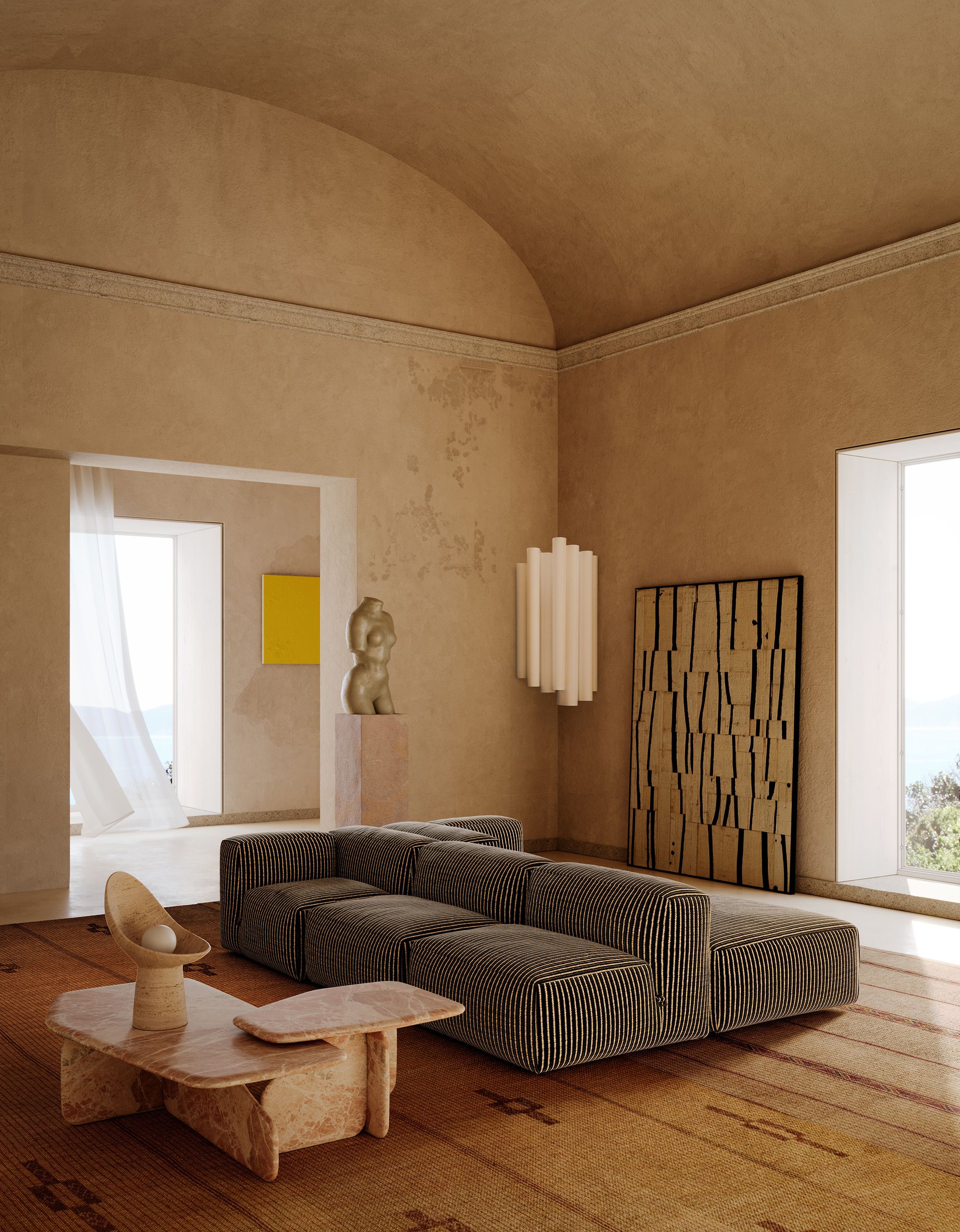
But perhaps his most interesting direction Milan Design Week 2026 was the rise of a new form"quiet luxury". An aesthetic based not on show but on emotional calm.
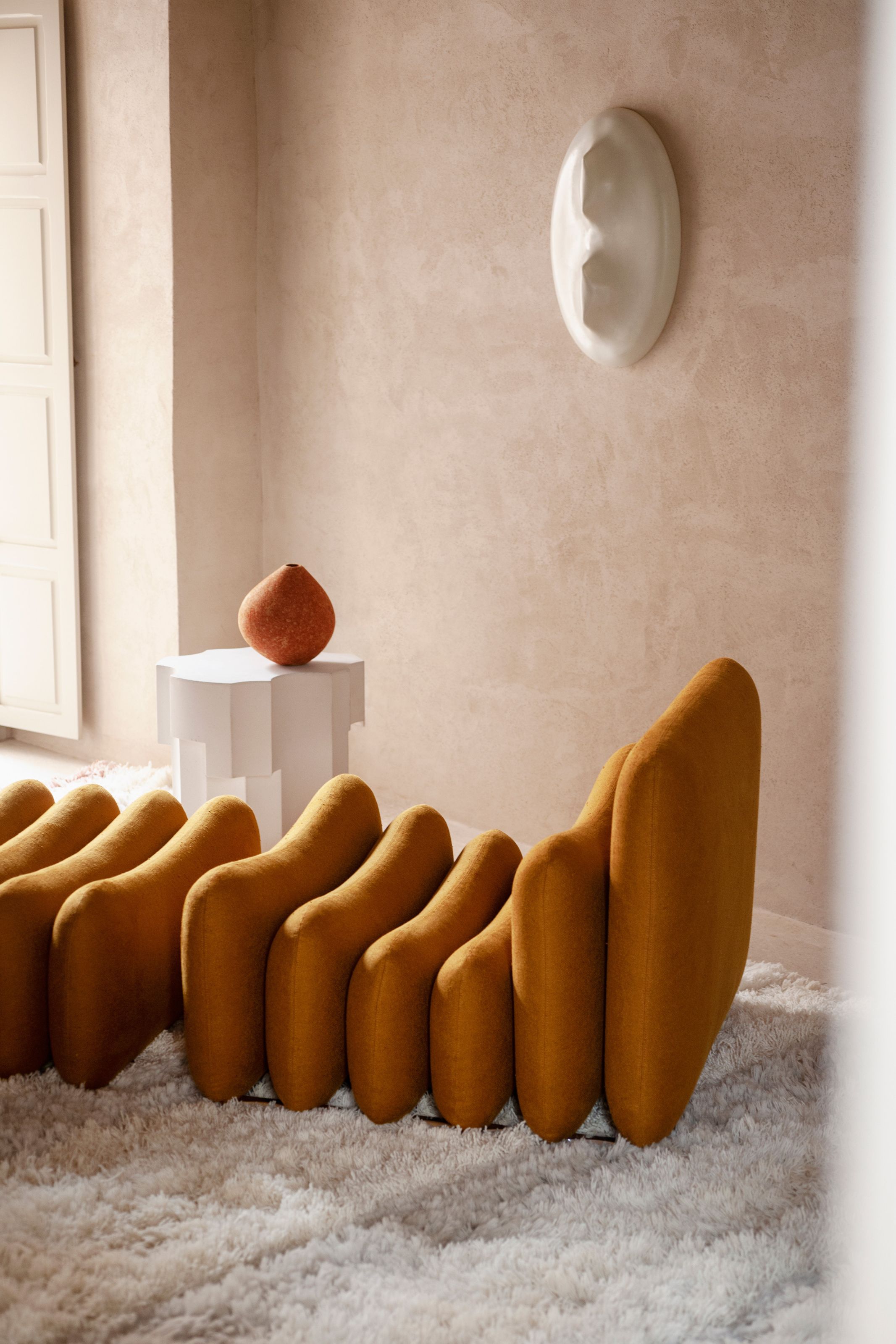
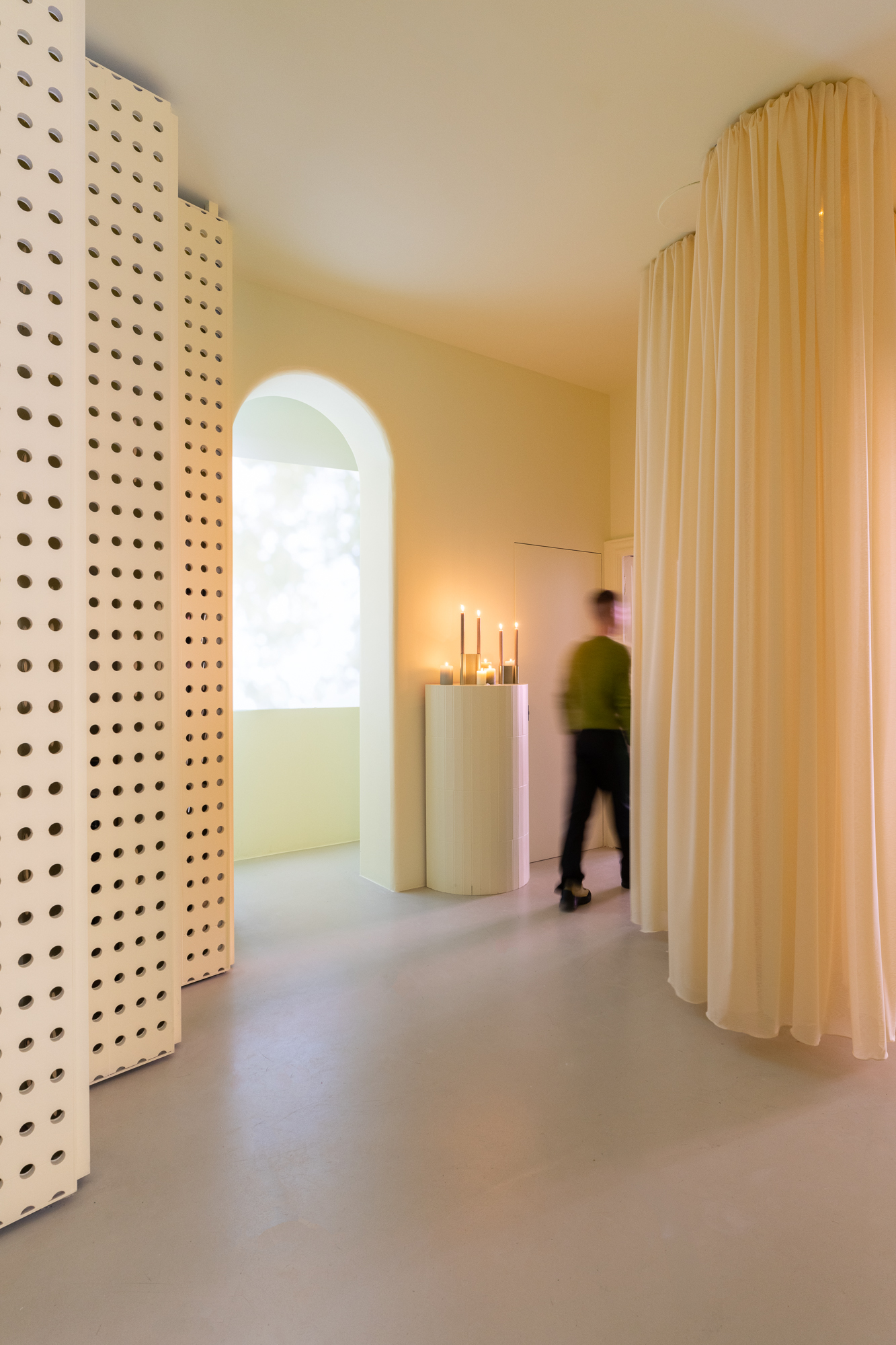
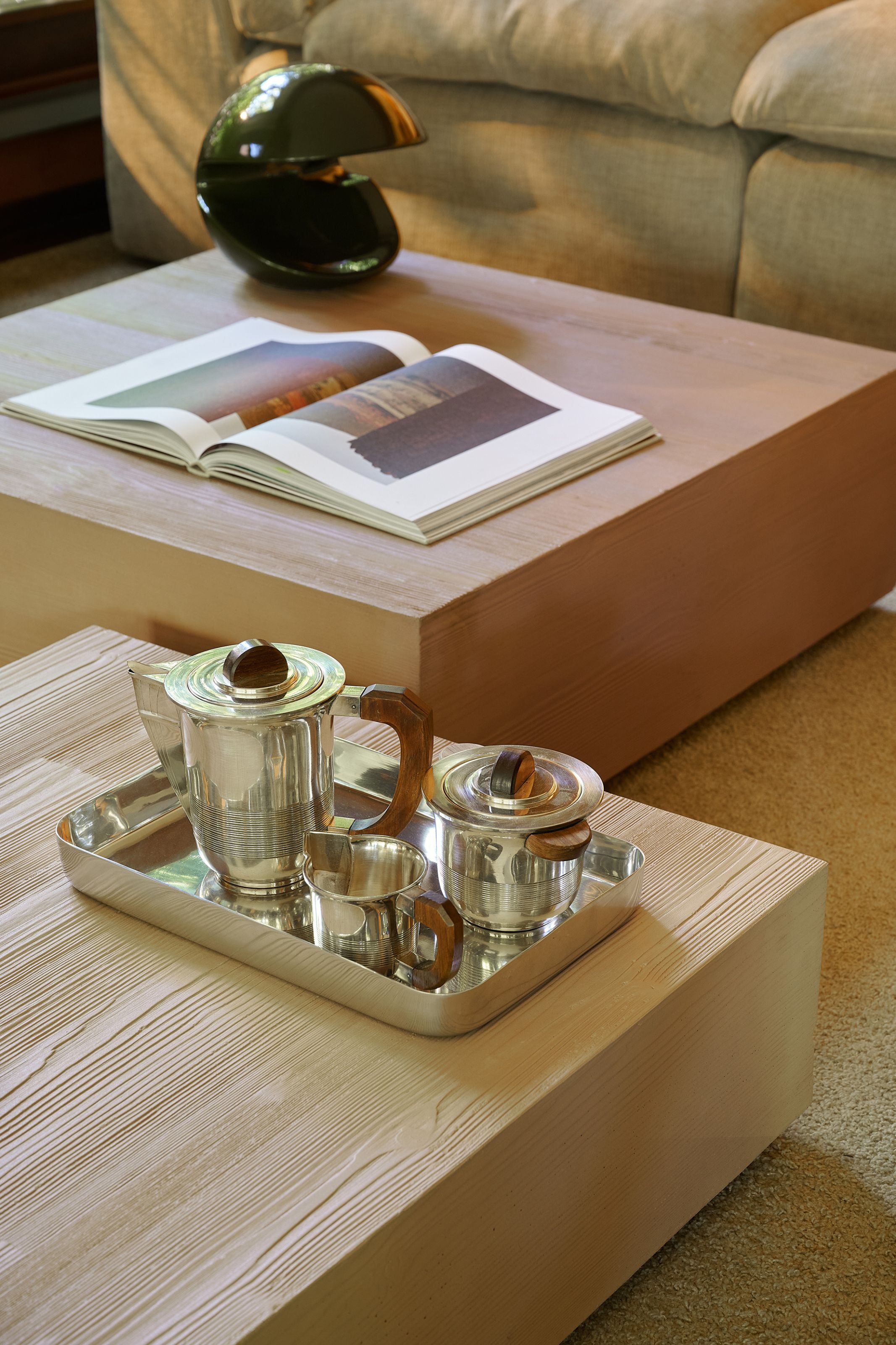
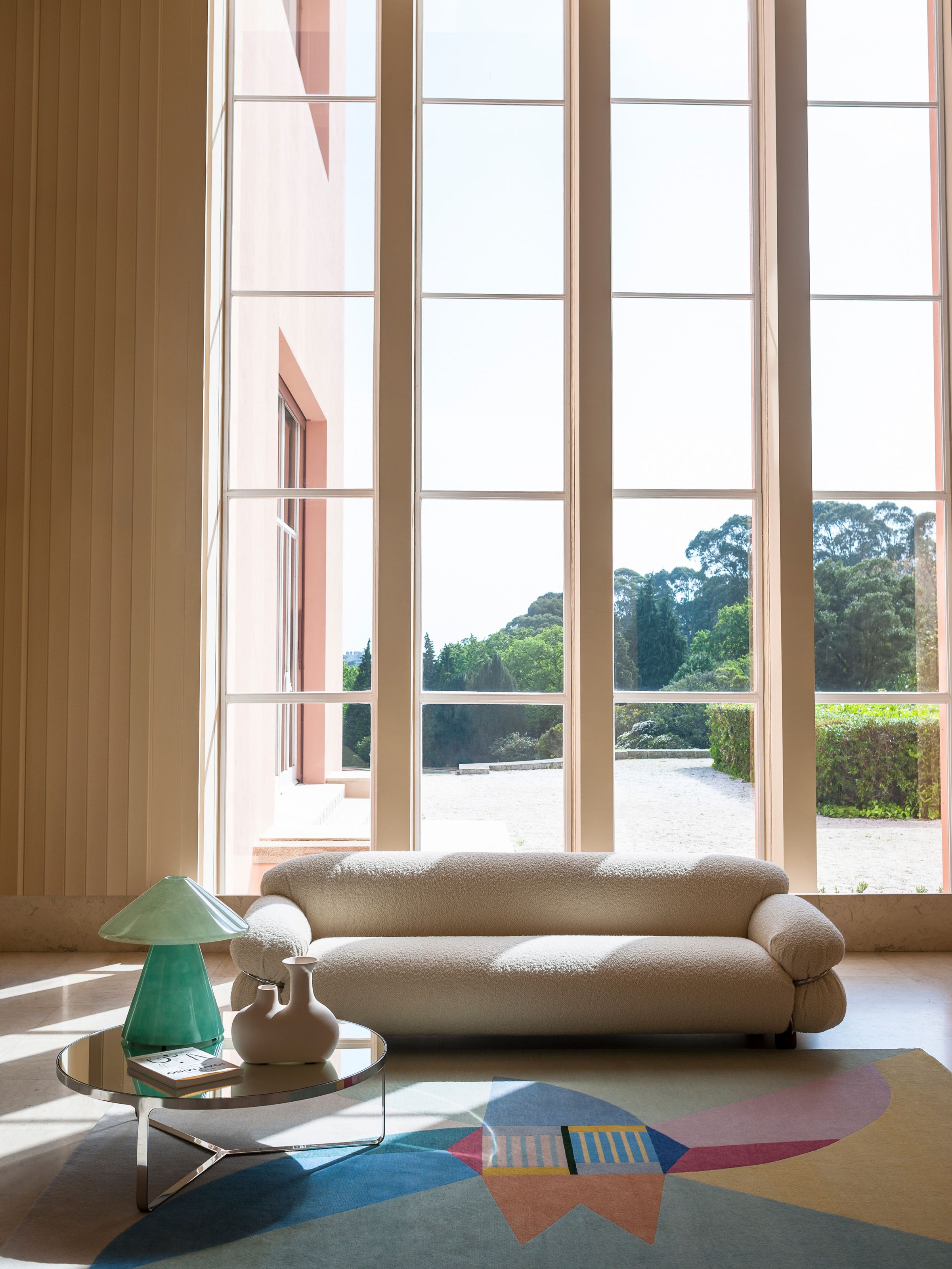
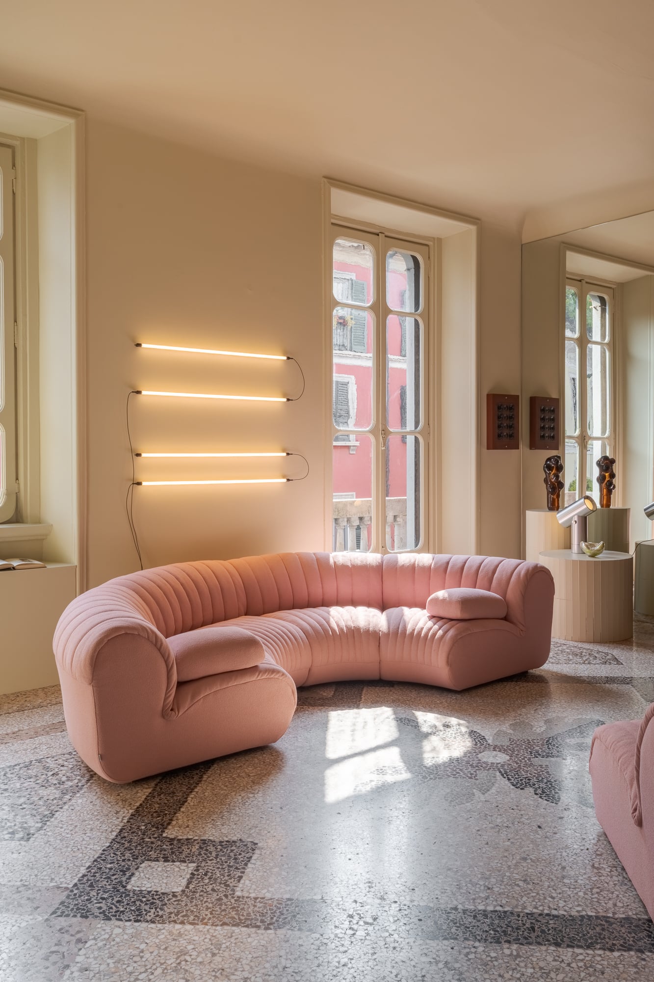
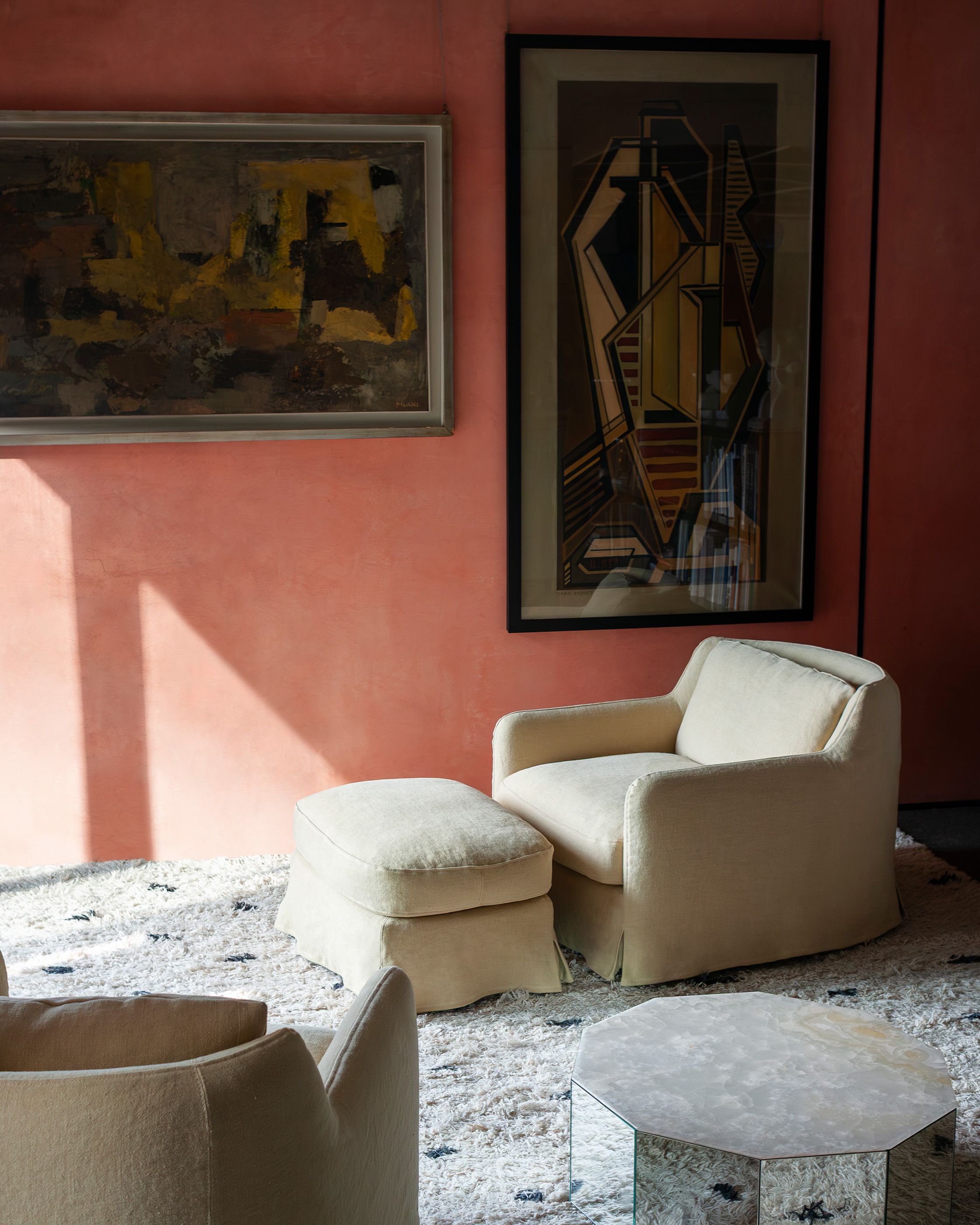
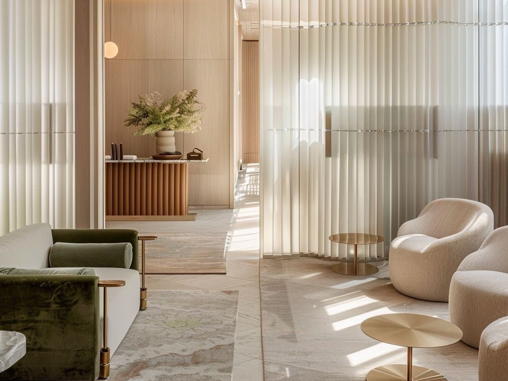
Powder shades appeared in most residential and hospitality spaces lilac, dusty pink, chalk mint, soft peach and creamy neutrals, combined with curved forms, diffuse lighting and textures that created a sense of comfort and security. What stood out was that these colors were not reminiscent of the old "sweet" pastels of the previous decades. They were more mature, hazier, more atmospheric. As if they were designed to calm the eyes and the nervous system.
It is no coincidence that more and more designers are now influenced by his world wellness, neuroscience and emotional design. The home is no longer viewed only as a beautiful space. It is treated as a refuge. A space where people want to decompress from the overstimulation of everyday life, social media and constant digital connection.

The new luxury is not the "show-off"
If anything became clear at Milan Design Week 2026, it is that the concept of luxury is changing. For years, luxury was associated with an impressive image, statement objects and extravagance. Today, however, real luxury seems to lie in the tranquility, the atmosphere, the silence, the comfort and the quality of the experience within the space.
The strongest presentations in Milan were not necessarily the most "charged". They were the ones that created emotion. Places that made you slow down, calm down and feel different in them. And maybe this is finally the biggest change that the new era of interior design brings.
Design is no longer only about what we see. It is mainly about what we feel.


In our next articles we will analyze more deeply:
- the materials that dominated Milan,
- the new forms and silhouettes in the furniture,
- the return of chrome and metallic finishes,
- but also how spaces are becoming increasingly immersive and sensory-driven in 2027.
The article includes insights and inspiration from international design exhibitions, new collections and trend forecasting platforms such as ITALIANBARK / TRENDBARK.

Leave a comment
All comments are moderated before being published.
This site is protected by hCaptcha and the hCaptcha Privacy Policy and Terms of Service apply.